ShopDreamUp AI ArtDreamUp
Deviation Actions


Description
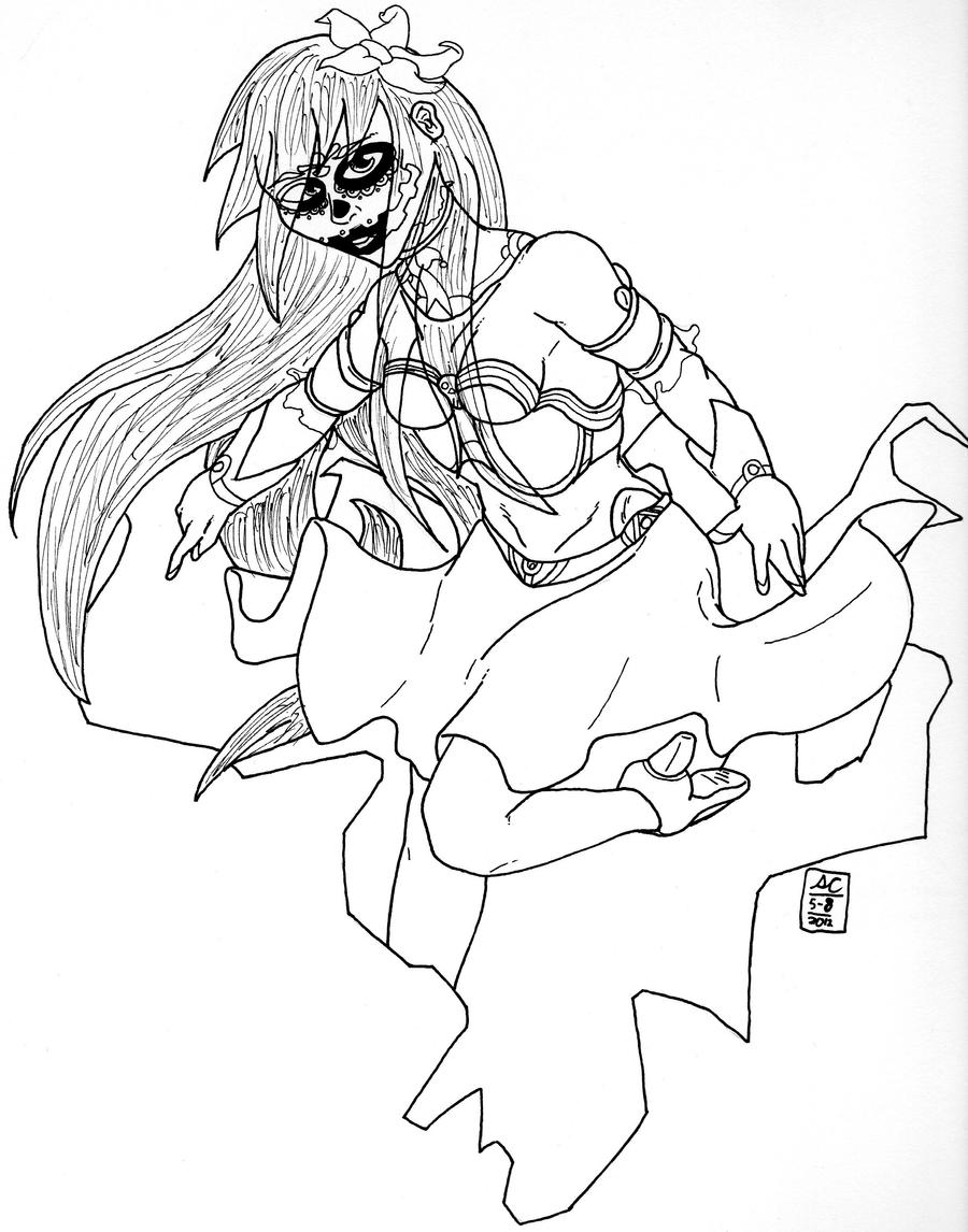
Well I'm back. And on a Friday too (which, according to my stats is when I post most of my work). anyways, this is Maria,with a slight change in her looks. This is because this was made AFTER I went to Sakura-Con up here in Seattle and I got a commission of one of my characters.
However, the artist that did it took some... artist liberties with it, which impressed me so much, that I choose to change up her look a little. An interesting byproduct is that this drawing looks very much like a tattoo.
However, the artist that did it took some... artist liberties with it, which impressed me so much, that I choose to change up her look a little. An interesting byproduct is that this drawing looks very much like a tattoo.
Image size
2436x3101px 1.11 MB
Comments10
Join the community to add your comment. Already a deviant? Log In
I know you requested a critique and I am sorry for the lateness but I had commissions and a gallery show to attend to and I make my living by my art.
Pros: I can see that some love and dedication went into the piece which is always a plus. The over all concept and design is interesting. It looks like you are trying to over come the fear of overlapping which is a hard lesson to learn.
Cons: While I can see that you are trying to overcome the fear of overlaping you still need to push this more which should help with your foreshortening. I feel like you were trying to fore shorten the arms but because the overlaping wasn't there it makes it look like the arms are pointed down and are stubby which is ruining the proportions. The breasts are too high on her chest and they should be about half a head lower. The hair overlaping the face shows some poor planning or making a mistake of where you were intending to go and tried to fudge the result. Sketch out your drawing lightly in pencil or better yet a light blue color pencil first and then ink over that. Then you scan it removing color or xerox it and the blue lines will vanish. Your inking could use some work. Try showing a variation of weight in your light to give the drawing movement and depth: think of your pen or brush strokes like a roller coster and you will get there.
Hope that helps.